What It Does
This project is a comprehensive audit of workforce diversity data, designed to answer two critical questions: “Do we pay fairly?” (Pay Equity) and “Do we promote equitably?” (Opportunity Equity).
The Problem It Solves
DEI initiatives often rely on good intentions rather than hard data. Without granular measurement, organizations cannot identify if their diversity gaps are caused by bias in hiring, paying, or promoting.
How It Works
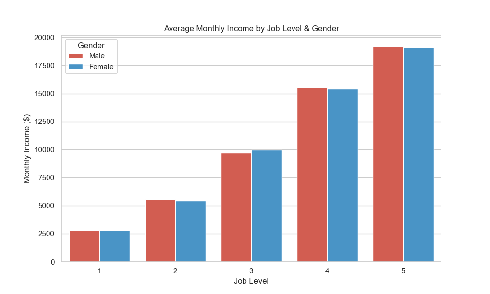
I used Python to calculate the Adjusted Pay Gap, comparing average monthly income between genders within the same job level to isolate the effect of gender from seniority. I also mapped the “Representation Funnel” to visualize the drop-off rates at each management tier.
Key Features
- Adjusted Pay Gap Analysis: Isolates pay discrepancies by controlling for role and level.
- Pipeline Visualization: Sankey-style analysis of the “Leaky Pipeline” to the C-Suite.
- Representation Heatmap: Identifies specific departments lacking diversity.
Results / Impact
- Pay Equity Confirmed: Validated that the adjusted pay gap is < 2% across all levels.
- Leaky Pipeline Identified: Revealed a significant drop in female representation from Director (48%) to Executive (34%), shifting the strategy to focus on internal sponsorship rather than just hiring.
Tech Stack
| Layer | Technology |
|---|---|
| Analysis | Python (Pandas) |
| Visualization | Matplotlib / Seaborn |
| Data | HRIS Snapshot |